


Imagine walking down a busy street while trying to read a tiny map that keeps blurring when you try to zoom in. That frustrating experience is exactly what customers feel when they open a non-responsive website on their smartphones.
In the current digital landscape, hiring an expert Website Development Company in Siliguriis the absolute best way to fix this issue immediately. Every business owner needs to understand that a digital platform must perform flawlessly on smaller screens to survive in this competitive market.
The way regular people browse the internet has changed completely over the last few years. If your business website forces visitors to pinch and zoom to read basic information, they will simply leave your page. You are essentially locking the front door of your business to more than half of your potential customers.
Let us break down the simple, everyday reasons why mobile-friendly websites are really important in 2026.
1. The Reality of Global and Local Search Traffic
Most people now browse the internet using smartphones, instead of the traditional, bulky desktop computers in almost every industry. Recent data from this year shows that smartphones drive more than sixty percent of all web traffic across the entire world.
In rapidly growing business areas across India, that number regularly goes much higher because families rely entirely on their modern smartphones. People use their phones to look up local restaurants, hire professional services, and buy everyday items.
If your business website does not work perfectly on these handheld devices, you are missing out on a massive amount of customers. A desktop-only layout acts as a barrier that pushes your target market straight to your competitors.
Local shoppers want answers right away, meaning they expect to find your phone number, address, and services within a few short clicks. Working with a professional ensures your online presence is built specifically for these fast-moving shopping habits.
2. Google and the Mechanics of Mobile-First Indexing
The systems that control search engines have changed completely, so the computer version of your website is no longer the main priority. Google now looks at the mobile version of your website as its absolute standard to decide how high your business ranks.
If your smartphone layout is broken, messy, or hard to read, your position in search results will drop on every device. You cannot reach the front page of a Google search today if your website fails basic tests for mobile phones.
Based on how the search engine processes information, here is how Google evaluates and ranks your business website:
- The Initial Check:When a user searches for your services online, Google immediately bypasses the desktop setup and reviews the mobile version of your platform first.
- The Good Path: If you have an easy-to-use mobile site that loads fast and looks clean, the search engine rewards your business with high visibility, helping you appear near the top of the search results.
- The Bad Path: If you have a bad mobile site that is hard to read or is slow, Google flags the poor user experience and pushes your platform down, leaving it hidden at the back of the search pages.
Search engines are programmed to keep web users happy by showing them websites that load quickly on modern smartphones. When a search engine accidentally sends users to a broken mobile site, it reflects poorly on the search engine’s own quality.
Therefore, websites that provide a seamless layout for phones are rewarded with much higher visibility in local search results. Proper phone optimization is no longer an optional marketing trick; it is a basic requirement for being discovered.
3. User Experience and the Bounce Rate
In the online world, the phrase bounce rate refers to the percentage of visitors who leave your website after viewing only one page. On small smartphone screens, a poorly laid-out website can cause your bounce rate to increase rapidly.
If a customer lands on your page and sees tiny text or messy overlapping pictures, they will instantly hit the back button. That quick exit signals to search engines that your website is not helpful, which negatively impacts your rankings and online reputation.
To give people a great experience, your website must feel natural and easy to use with one thumb. The buttons must be large enough to tap easily without accidentally selecting the wrong link, and menus must be short and well-organised.
The text size needs to change automatically so that it remains easy to read without requiring the user to adjust it themselves. When you respect the time and effort of your visitors, they tend to stay on your website much longer and read your content.
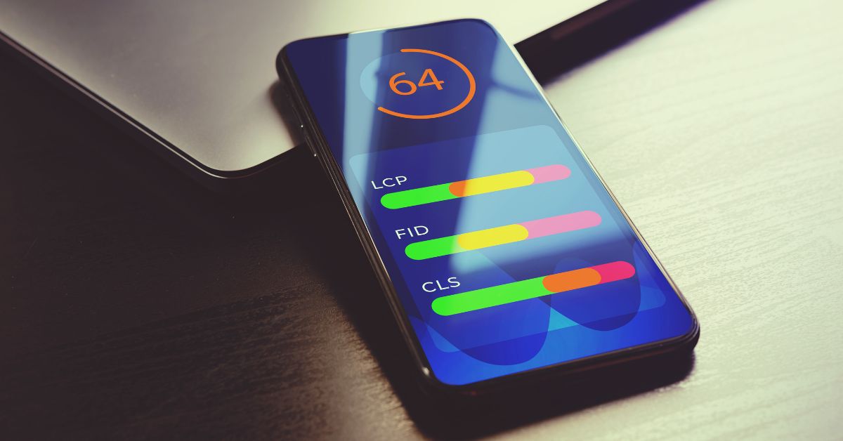
4. Speed Optimization and Core Web Vitals
Modern internet users have very little patience for slow websites, especially when they are using mobile data networks. Technical tests show that a majority of phone users will completely close a webpage if it takes more than three seconds to load.
Your website might load fast on an office computer, but it must perform just as well on a smartphone screen. To speed up your website, you must compress large image files, have clean website code, and utilize faster delivery networks for your content.
- Simple Tip:Google uses specific rules to measure how stable and fast your website looks when it loads on a phone screen. If images and text are scattered around while the page is loading, your website will fail the basic quality checks.
A clean mobile website features a lightweight design that requires minimal internet data to display your business information to the world. Fast loading times directly determine whether a visitor makes a purchase from your business or leaves due to annoyance. To keep your exit rates low and your customer interest high, speed must be your main priority during the building phase.
5. Enhancing Mobile Conversion Rates
A business website is built to deliver real-world results, such as gathering email sign-ups, booking customer appointments, or generating sales. However, turning a smartphone visitor into a paying customer requires a shopping or contact process that is completely error-free.
If your contact forms require too much information that is difficult to type on a phone, customers will likely quit. Cutting your question forms down to just three or four basic lines will noticeably increase your customer messages and profits.
Adding modern payment options such as mobile digital wallets can also eliminate the hassle of manually typing credit or debit card numbers. When the path to purchasing your products is smooth and simple, people are much more likely to complete their purchases immediately.
A perfectly tuned website builds instant trust, making your business look professional, reliable, and modern to every single customer. By making the process easy, you turn regular website traffic into steady, highly profitable money for your local business.
6. Social Media Traffic Realities
Most business owners use popular social media networks to advertise their services and post direct links back to their company websites. What many people forget is that almost all social media browsing happens entirely inside smartphone apps like Facebook and Instagram.
When a customer clicks your link inside those apps, your website opens inside a special built-in smartphone browser window. If your website is not set up for mobile phones, that social media traffic you earned is completely wasted.
Visitors coming from social apps are usually in a hurry and expect a smooth jump from the app to your webpage. If your business page appears broken or loads too slowly within the social app, users will quickly go back.
Your social media marketing plans can only work out well if your website is ready to receive that exact type of visitor. Ensuring your website functions properly within these social app browsers is crucial to maximizing conversions.
7. Adapting to Diverse Screen Sizes and Foldables
The smartphone market is no longer filled with just one standard size of screen, because companies keep introducing new folding phones. A truly modern website must look beautiful on a small budget phone just as much as a large premium folding screen.
Old-style rigid layouts break completely on these new devices, causing blank spots or text that gets cut off mid-sentence. Smart fluid layouts allow your text and pictures to stretch or shrink automatically to fit whatever device your customer is holding.
A flexible online store requires constant testing on real devices, different phone brands, and various internet apps like Safari or Chrome. Your images must change size on their own without turning blurry, and your columns must stack together logically.
You protect your digital asset from becoming outdated and useless in a few years by preparing for new phone shapes today. This level of design flexibility is the secret to creating a business website that lasts for a very long time.
Selecting the Right Development Partnership
For making website to work efficiently on a phone, it requires deep technical knowledge, great coding skills, and a clear understanding of user habits. It takes more than just making pictures smaller; you have to rearrange your information so it makes sense on a tiny screen.
When you partner with a team of experienced professionals, you ensure your layout looks beautiful while running quickly under busy conditions. They will handle all the complicated technical steps while you focus on running your day-to-day business operations.
Experienced web developers know exactly how to balance pretty designs with fast loading speeds, keeping your site beautiful and efficient. They test your website on many different real phones to catch and fix display errors before the public ever sees them. This team effort gives you peace of mind, knowing your online storefront is built to turn casual visitors into loyal customers.
The Digital Marketing Team at Cyber Help India specializes in creating fast and high-converting websites that help local businesses prosper across a competitive market. They combine clean layout aesthetics with strong technical work to ensure your brand stands out and delivers an exceptional smartphone user experience.
Final Thoughts
An easy-to-use mobile website is the basic starting rule for making money and growing your brand name in this fast-moving year. Ensuring your website runs perfectly on handheld devices is the single best investment you can make to protect your share of the market.
Partner with a premium Website Development Company in Siliguri to secure top search engine rankings and deliver an incredible customer experience
