


The responsive typography technique is the most important part of designing a responsive website because there is no meaning in making a website look good unless the audience finds the texts readable. When it comes to design the website you need to keep many things in your mind rather than resizing the text’s container and keeping the text reflow. Some of the important points like font type, font color, legible font size, line heights and maintaining the line length on different screen sizes come out with the ways to achieve a truly responsive text on the website.
Here, we will highlight some of the needful and effective steps that will bring attractiveness on your responsive website so that everyone will find your website appealing by opening the website in their own devices. The need for designing a responsive website comes with the popularity and craze of mobile phones and tabloids. The website must look good in different devices whether you are using a desktop, mobile or any other device.
Keep the Text Accessible
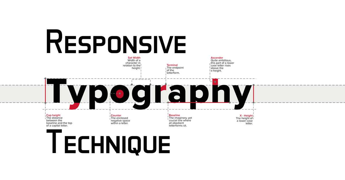
You should keep the text accessible and legible before getting into the typography technique of resizing the texts. You must understand the importance of color contrast and how to make the text eye-catching. Using too many styles and making the text complex is not the right way of managing the text in your responsive website. There is no meaning in learning the techniques of resizing the texts unless you make it legible and accessible. Three points help you make the text readable.
Select a Readable Font Face
In a responsive typography technique, choosing and selecting the text is not so easy, you may go through different websites and study their way of presenting the texts. Choosing an artistic font for the heading is advisable whereas the body of the content must be presented by using simple and readable fonts. Take your time to come out with the best result instead of arranging everything in a hurry. A text is really important to keep the eyes of the visitor into your content. There are different services available to find the best for your website.
Accessibility of Font Colour
To make the text accessible it is important to think about choosing the right color along with the text font. But up to some extent color plays a big role to make the text visible. You might notice how the text looks when you use a light color over a white background. It is important to place the right color for the right background otherwise visitors will find it difficult to read. After the color, the designer must think about the contrast because adjusting the contrast suitably will make the white-colored text visible over the white background. Colour and contrast create a huge difference in making the text accessible to readers.
Rather than using text within graphics try to use �real� text
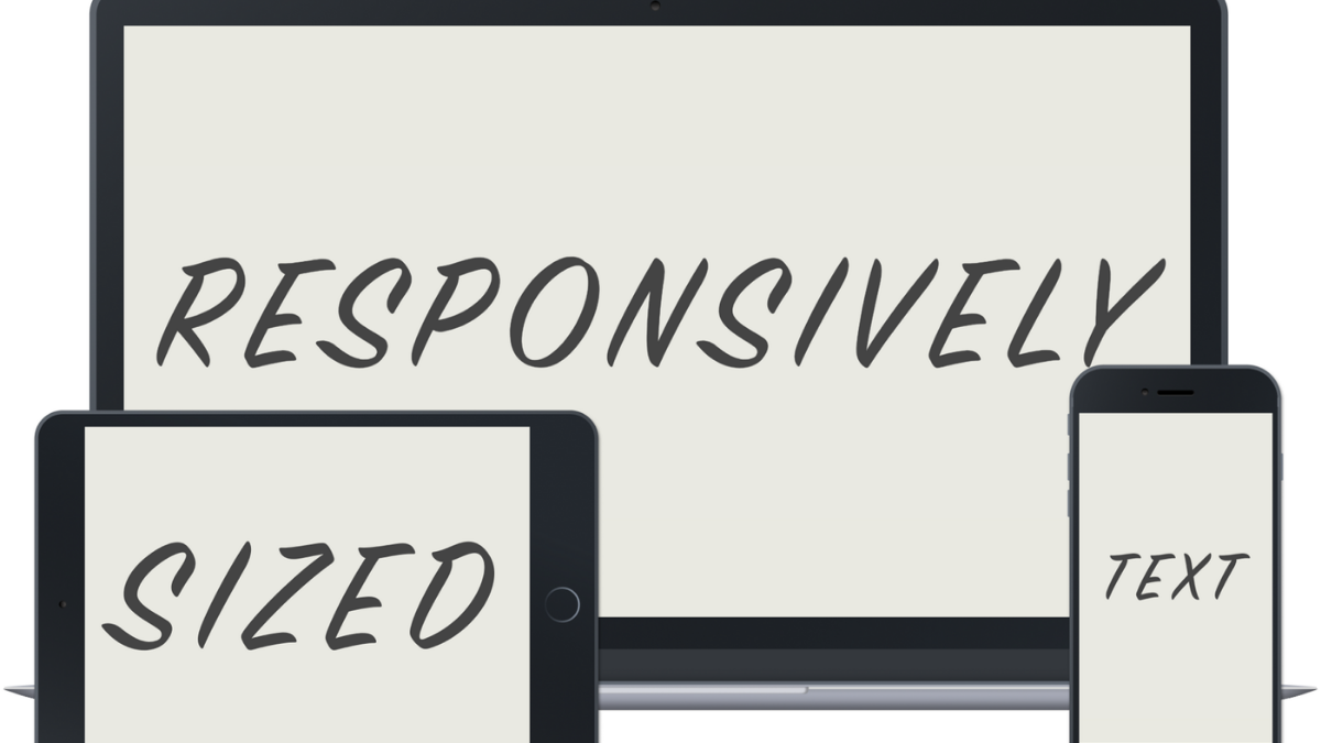
The reason behind designing a responsive is known to everyone. Yes, it’s all about making your content available to every user in different devices. Using graphics is also important but make sure your text should be visible within the graphics. Using real text rather than using it within the graphics is very important because ultimately it is your content that matters. Make sure that the contents must respond to your users’ needs so that they can access it from any device no matter the context.
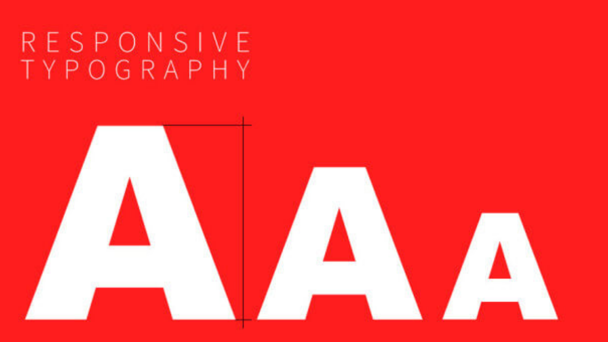
Keep the Headlines bigger
Arrangement of the text is always important to add a sense into your content because readers need to feel the rhythm while reading the contents instead of getting confused. Keeping the headlines in bigger size makes the thing simple and meaningful because it helps the reader to understand the flow. Making a big responsive headline can be done by using a jQuery plug-in which makes it possible to create big, bold, responsive headlines that fill the width of their parent element at any size. Another way if to implement CSS Viewport units which is very much helpful as it allows you to make sure that the text will always fit into its container’s width because the font size changes with the effect of initial containing block, the viewport manages the size of the browser window, and the width changes, the font size changes as well.
Adjust Line Space
Heights and lines in the web content are traditionally known as ‘leading’. You might learn about leading lines which is often used in photography. The leading line or space between the texts plays an important role in making the content appealing. Many times people neglect this part but to keep the interest of readers into your content needs proper lines and gaps. Unpleasant gaps need to be avoided and make sure that your values are directly proportional to your font size or not. The systematic arrangement of the texts in the web content catches the attention of readers which is important for designing a responsive website.
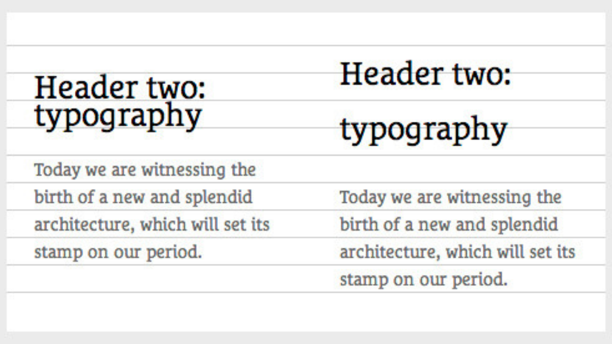
Use Visual variation instead of Size
Working over-responsive website makes things slightly different from others. Don’t be confused in understanding this point. In simple words here you must concentrate on the visual variation which all about keeping the subheads different from the heading by using uppercase, small caps, italic, bold - maintaining the same font size. Do the proper positioning of the paragraphs and use white space to separate sections. Remember that bigger heading looks good in the desktop as it adds a dramatic feel but will make the content smaller in the mobile version.
Importance of Type Test Rig
CSS and juggling type libraries are not conducive to maintain the creative flow. Typetester is now a fully-fledged WYSIWYG web typography editor. You can use, test, compare and even design texts with more than 2800 web fonts by taking them from different sources. Try to export your designs into fully responsive HTML and CSS snippets. It is essential to use tools like Typetester which makes it easier for a designer to try font, size and spacing combination in terms of making the website look good.
Every typography technique is useful to make the responsive website appealing and attractive within the eyes of users. The intention of a designer must come out with the engagement of more and more visitors on the website. To engage more visitors into the website it is important to learn the techniques and placing the texts in the right place by using a standard font with needful space and proper size.