


Development is all about making things easier and user-friendly. The time you open a website you might be comfortable with it in your desktop but this generation spends most of their time using mobiles and that makes it important for everyone to go for responsive website design. At first one must know about the importance and benefits of designing a responsive site. The site that is flexible and responds well in multiple devices is called a responsive website which helps people to browse the site in their own devices instead of searching for any desktop.
There was a time when mobile phones used for calling and messaging but now the scenario has changed. A few costly mobiles of that time come with the option of GPRS where you can browse websites taking a lot of time and effort. Designers come out with Dynamic Serving and Separate URLs in order to make the website available on mobile phones. But with the advancement of technology people start moving ahead and makes the thing quite simple and easier by introducing responsive sites that work faster in multiple devices. Here, we will describe the steps involved in converting your existing website into a responsive one.
Let’s start with the steps to turn any website into a Responsive site
Work over Breakpoints and Layouts
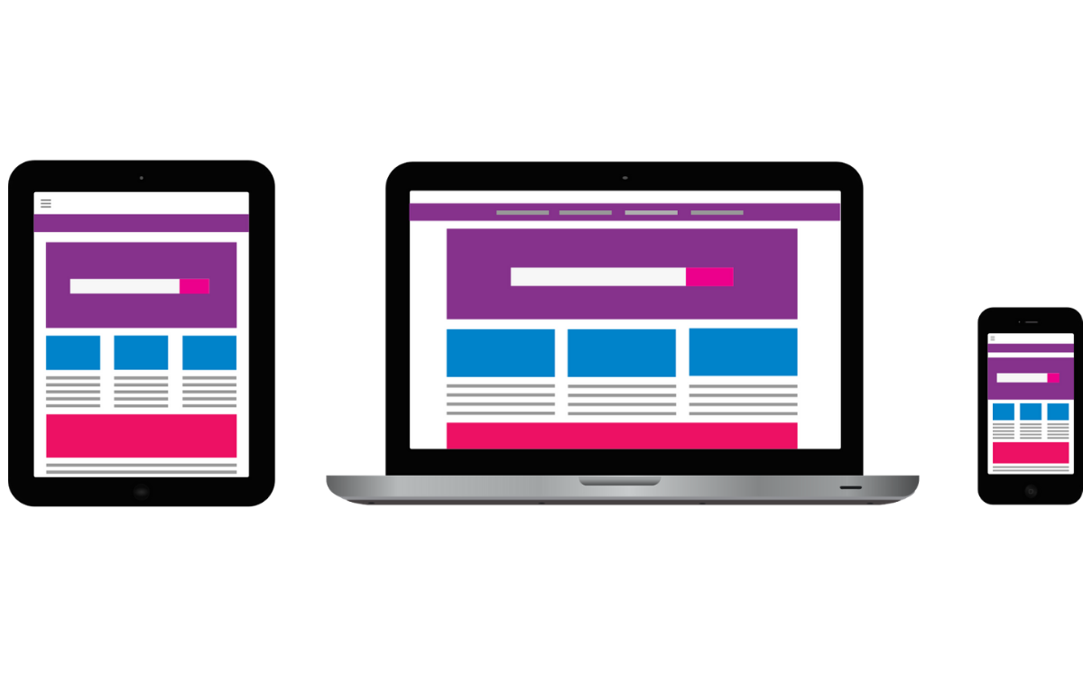
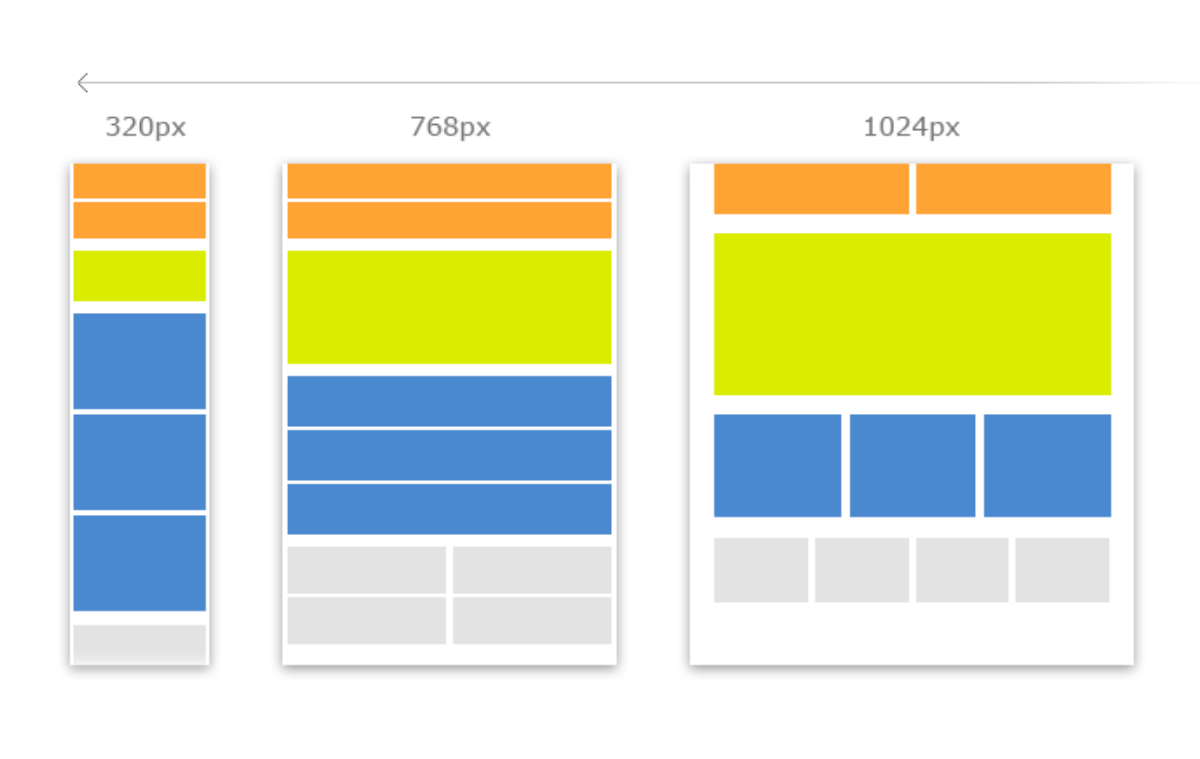
The first step begins with planning for layouts; you need to decide how many layouts are required to make your website responsive and user-friendly. Different devices come with different layouts and that makes it important to plan a unique layout for each device that your website is being visited on.
Determining the breakpoints is really essential to plan multiple layouts and you can deal with it by exploring your existing website. By analyzing the website you can find out where the break down happens. Once you are done with this you must define appropriate breakpoints to execute how your contents will get adjust in different screens.
Include Responsive Meta Tag
Once you finished the process of designing breakpoints and layouts you must start working for the next step that is all about making the responsive design familiar with mobile browsers so that users will read the contents properly and the contents will fit into the mobile screen with pinch-to-zoom in functionality.
To develop the best design one must change and work over the zoom behavior so that anyone can handle the features comfortable in their mobile phones. You might notice when we open the responsive site on our mobile it makes the contents bigger or readable by changing the pattern s per the mobile screen.
Application of Media Queries
This part is really very crucial and important for designing a responsive site because the media queries allow the designer to define the CSS style according to the devices. Whether the user is going open the site on mobile, tab or desktop, in each of the platforms the resolution and size of the screen varies. By applying media query you can manage the compatibility in an advanced way.
To find out the required media query that suits your website you should analyze the breakpoints and layouts one more time. Getting into the beginning steps will make the process more effective and valuable for your responsive website design. The user will find a better result while opening the website on different screens.
Deal with Navigation and Typography
To handle the navigation and typography part in a perfect manner is the greatest challenge for any web designer or developer. Navigation makes the website more intuitive and explanatory and on the other hand, typography makes the existing website liable and readable in any device. Both the part is needed to be done very carefully to turn the website into a responsive design.
Normally, we visualize a site on a big screen in comparison to mobile but to compress navigation to make the website fully accessible into small screen it is better to use either a drop-in or an off-canvas menu whereas, to achieve better legibility, flexibility and readability in Typography across all devices, take advantage of Responsive Typography.
Work with Media Flexibility
In simple words, media flexibility is all about managing the media on different platforms and sites. Image and video featured in your existing website might not get adjusted into the responsive design and that comes with a disaster. Keeping the media flexible is necessary to make the media available for every device.
It is important to optimize the media size and making the media readable in every device whether you playing it on a mobile, tab, computer or TV. So, this part is crucial and effective enough to keep the layout flexible by preventing the size of getting large than the canvas or vice-versa.
Get ready for Different Types of Interaction
At last, you will be on the final stage when the website needs to get tested over different devices. You need to be conscious and attentive while interacting with different devices. Make sure that your website should run smoothly in all devices and if not, please go through the earlier steps one more time. In a desktop or computer, we use a keyboard and mouse to browse any website but on mobile, we use a finger instead of a mouse.
So, the developer must consider making the website compatible with the finger as well. Different devices come with a different layout in both hypothetical and practical ways so one needs to manage these parts carefully.
Every segment needs to be updated according to the needs of the generation otherwise there is no meaning in making a website. A responsive site is so common these days that you must work over this segment and get out of your difficulties. If you are a developer then you can easily follow these steps in a systematic manner and if not then consult with any website designer to make a solution to your problem.