


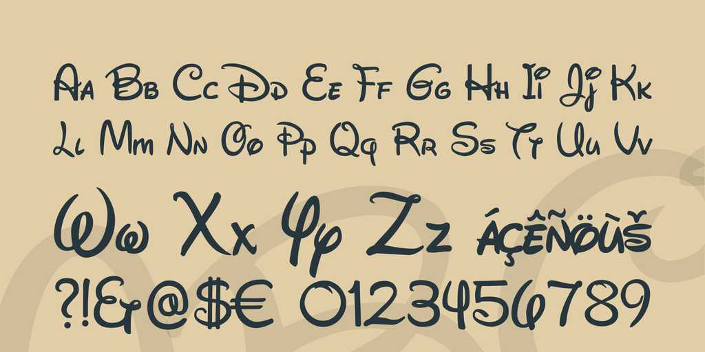
The right choice or selection of font style or typography has a huge effect on creating excellent graphic design. It brings out the purpose of the image and all the elements together make the impression of the design on a visitor. On the other hand, if something goes wrong with choosing the right font style, or it doesn’t match with the theme or image, it might result into great disaster for the design, and for you too.
With day-to-day progress in digital designing world, several fonts have come up with their own feature and uniqueness. There are some typefaces that the professional graphic designers worldwide like to use for their design to be innovative, attractive and descriptive. Let’s check out some of those professional fonts.
Bodoni
To make the texts, headlines and logos decorative, the Bodoni range of fonts works great. Especially the Poster Bodoni font is favoured by the skilled designers for strong contrast and versatility in usage. The thick and thin strokes and complete geometric structure create extreme contrast on the face.
image credit: www.stumbleupon.com
FF Din
Created by Albert-Jan Pool, a Dutch type designer, FF Din is very much popular among creative designers. The architecture and design of the font makes it attractive and that is why it is widely used for creating advertisement, packaging, logo, branding purpose and so on.
Aviano
At the base of the Alps of Northern Italy, there is a town named Aviano and the font is named after that. Type designer Jeremy Dooley designed this gorgeous typeface, inspired by the timeless beauty of mighty letterforms of classical style.
Trajan
The old type serif interface of Trajan is designed by Carol Twombly in 1989. Roman square capital is the base of this design, and also utilised for inscriptions of Trajan Column’s base. This font style can be observed frequently in Hollywood movie posters for attractive look.
Bickham Script Pro
This font style is primarily utilised for occasions which are formal. Bickham Script Pro is a style that is suitable for every designer. This is one of the top trending typefaces for designers that are little different in style and structure than the previous ones.
FF Meta
Erik Spiekerman designed PT55 as an easily readable small size font. Later he continued adding more weight and style and gave it the name of FF Meta. This professional typeface is included in the permanent collection of 23 fonts in New York Museum of Modern Art, representing the typography of digital era.
Brandon Grotesque
Hannes von Dohren designed the font style of Brandon Grotesque. It originated from the influence of popular geometric-style, sans serif typefaces of the era of 1920s and 30s. Fin case of professional and composite photography, this font style works appropriately.
Rockwell
The Litho Antique font of the 1910 era was the source of inspiration in creating the Rockwell typeface, which belongs to the classification slab serif. The monoweighted stroke in Rockwell is utilised mainly to display, instead of lengthy bodies of text.
