


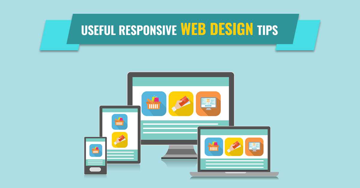
A Website helps a business in providing necessary information simultaneously to engage more visitors into the site that will effectively increase the traffic. This generation is getting habituated with the use of mobile and likes to spend most of their time using mobile devices. From chatting to clicking selfies the importance of mobile is increasing day by day. Web designers must put their concentration towards creating a responsive web design to make the websites get fit into the mobile screen.
If your business website is not responsive one then this is the right time to convert your site into responsive web design to increase the number of visitors. At the time of creating any responsive website, one needs to keep some of the important points in mind to make the website more appealing and useful for users. Here, we come up with useful tips that will surely help you to make your responsive web design more attractive and user-friendly.
Useful Tips for Responsive Web Design
Observe how visitor use Mobile
The same website will be viewed in a different depending upon the different platforms. You must observe the difference by noticing how your visitors are visiting your website in their by analyzing the analytics. Why and which page is viewed more need to be taken under consideration. If you notice that they are familiar with the contact page in comparison to other pages then you must highlight the contact page in your responsive design to make it easily available by implementing the smart technique.
Plan your Design at the beginning
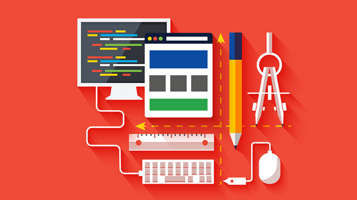
Just like an architect, a web designer also needs to create a design at the first stage. The blueprint of the building helps the architecture to implement necessary tasks and here the designer create a wireframe to get the visual description of the upcoming website. By planning the design a designer will get a better idea about the responsive site and at the same time can customize the templates depending upon the requirements. Proper planning will come out with an appealing responsive site.
Deal carefully with the Navigation
Navigation is really important to help users in accessing different pages on your responsive web design. On the desktop version, you will find links of different pages that are visible on the site but in the mobile version, you will find an icon that hides the links behind it. It is important to highlight the icon to make it distinctly visible on the small screen. You or the designer of your website must deal with this part very carefully because if the visitor fails to find the icon then they will feel irritated by not getting access to other pages. You can use attractive colors or make the icon more attractive to help the visitors in accessing other pages.
Image Optimization
.png)
Images are really important to catch the attention of visitors into your site. When someone visits your site, it is the images that attract them to access other pages. So, while putting the images you must be concerned with the optimization part as it keeps the images visible in different devices. Optimize images fits-in to the small as well as big screens. By keeping the required format like TinyJPG or PNG you can manage those breakpoints and also reduce scaling and bandwidth issues. Images add sense to your site and help visitors to stay connected for a long time.
Consider Mobile Friendliness
Even after working over the optimization of images you need to design a mobile version of your website to make sure that how the images and texts will appear on the small screen. This part is essential to keep the perfection in responsive web design as the visitors will feel comfortable by getting the desired visualization. Converting older version into mobile version is to make the things smaller, its lot more than that as the designer needs to work over genuinely managing the formats to make it appear in the correct format. Once you test your website by checking its compatibility in each of the devices, you can adapt your design to a large screen.
Make use of Media Queries
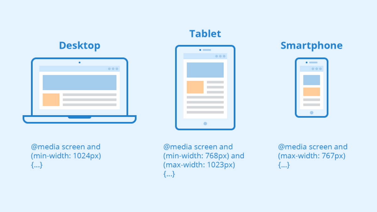
Media queries are considered as the initial part of CSS where CSS stands for Cascading Style Sheets. In simple words, media queries help the designers to make the website truly compatible with the different devices in terms of managing the resolution of the display according to the screens. The main role played by media queries is that they allow a designer to optimize the layout of the website for various screen widths.
Adding Keyboard Triggers
Visiting any website in a desktop might make you feel comfortable as you will find a bigger space and getting a keyboard for fast typing experience. But do you know that numbers of mobile user are increasing day by day and most of the people nowadays prefer mobile for visiting any website as it gives them the freedom to avail the services anywhere at any point of time? Keyboard trigger is the pop-up keypad window that appears when a visitor wants to type anything on the website depending upon the situation. The form or the field should immediately trigger the numerical keyboard whenever it is needed.
Make the buttons easily visible on the small screen
Designing is not only about making the website attractive and appealing you need to think beyond that which welcomes working over the buttons. The buttons that appear on the website can be easily clicked when opened in a desktop but if the buttons can be easily visible on the small screen it allows visitors to click the buttons even on their mobile. Sometimes, it becomes difficult for the users to touch the small buttons and they might click on the wrong place while handling them. So, the designer must ensure that buttons can be easily clicked on smaller screens too.
Typography Optimization
Even after covering all the parts you need to be conscious of the text. The text is the most important element of any website because only images can never make the impression until you make the text readable. The standard size for the body of the paragraph is 16px or 1em whereas the line-height of the text can be adjusted by 1.5em so that the visitors will find a delicacy while reading the blogs and contents. Avoid using decorative texts as they are hard to read especially on small screens.
Use of Micro-interactions
.png)
Finally, you need to add some animation and graphical display on your website to make the site more attractive and catchy in the eyes of visitors. Business websites come with appealing micro-interactions to have interactive functionality for better user experience. Just like images, animations play a vital role in making the visitors feel interested in your website. The designer should stay focused on implementing those micro-interactions in terms of jumping into the spotlight.
The above tips will help you to create a mobile-friendly responsive web design which will meet every requirement of the business. It is suggested to hire a professional web designer if you are not so comfortable with the designing part. Above all, a responsive website is not just a trend but the most essential step that needs to be taken into consideration to increase profit through more traffics.
